
Learn how to choose the perfect paint colors that complement oak cabinets, whether you’re dealing with light or dark finishes. This guide covers trending paint choices for 2026, explores the effects of different wood tones, and explains how to integrate accents for a balanced design. Discover expert insights into avoiding common painting pitfalls and increasing your home’s value.
Perfect Paint Colors to Elevate Your Oak Cabinets
Understanding the Warmth of Oak Cabinets

Characteristics of Oak Wood
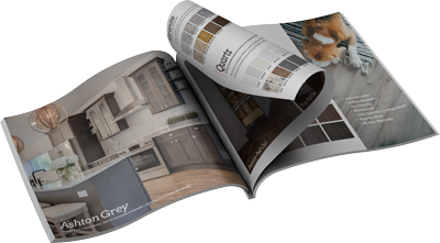
Oak wood, renowned for its durability and attractive grain, forms a primary aesthetic component of many kitchens. Its natural commercial appeal is amplified by its strength and timeless appearance, often seen in honey oak cabinets, which can imbue a kitchen with warmth. This lovely grain pattern varies enough to give each cabinet a unique appearance while retaining a cohesive aesthetic across kitchen interiors. These characteristics ensure that oak, particularly when used in cabinets, stands the test of time both in terms of style and in the context of trends in cabinetry design.
The variability in oak’s appearance is not limited to its grain but extends to its color spectrum. The great variety of color tones found in oak—from light, almost ivory shades to deeper honey and reddish hues—adds another layer of complexity to cabinetry. Understanding this spectrum is crucial for achieving interior harmony. These nuances mean that choosing paint colors that go with oak cabinets requires careful consideration to match the desired ambiance and the existing cabinetry style. Newer models incline towards showcasing oak’s warm tones, aiming to create a more radiant, inviting space.
Furthermore, oak’s strength does not just confer physical durability but also a design endurance that surpasses fleeting trends. The wood’s intrinsic warmth, particularly when encapsulated in honey oak, enhances room designs by offering a balance between classical elegance and modern warmth. This balance makes oak a popular choice in creating kitchens that are both functional and stylish.
Why Oak’s Warmth Matters
Warmth in oak, particularly in popular honey oak models, is not just an aesthetic detail but an underlying feature that dictates design choices in modern interiors. Its significance lies in the ability to create a cohesive and inviting atmosphere that encourages comfort and style. Understanding these warm properties is fundamental when pairing paint colors to ensure a complement rather than contrast. Warm colors often help augment oak’s natural features, creating a seamless flow in the room’s design.
In kitchen spaces where oak is prevalent, the goal is to find paint shades that harmonize with the wood’s innate warmth without overshadowing it. The idea is not just to match colors but to cultivate a celebratory airiness or coziness as needed by the overall design. Paint choices that neglect this warmth run the risk of clashing and ultimately missing the chance to highlight oak’s full potential.
It’s important to consider the dynamics of light in your kitchen space when integrating oak cabinetry. Oak’s complexion can change with lighting variations—from natural sunlight to the type and positioning of artificial light sources—impacting how paint colors appear against it. This interplay between oak and color under different lighting conditions can redefine the warmth and aesthetic appeal of your kitchen space.
Trending Paint Colors for Oak Cabinets in 2026
Neutral Tones That Harmonize
Neutral tones have steadfastly maintained their standing as go-to choices, offering a serene complement to oak cabinets in stylistic designs of recent years. Modern kitchens have seen the resurgence of interest in subdued palettes that can enrich the natural warmth of honey oak but remain fresh and timeless. Warm whites, soft beiges, and muted grays stand as excellent examples of how neutral tones enhance oak’s beauty without overpowering it. These shades serve to create a seamless and stylish environment that appeals to a wide range of styles and personal preferences.
Beyond the simple aesthetic appeal, neutrals like taupe or greige integrate well, providing balance and harmony across varying styles. Their understated elegance is a perfect backdrop to oak’s vibrant grain patterns, ensuring they remain the stars of the show. Read more about two-tone kitchen cabinets and how they incorporate these elements seamlessly…
An ROI analysis favoring neutrals often highlights their broad appeal in real estate markets. Kitchens using sophisticated neutral palettes to complement oak cabinets can reportedly yield higher returns by attracting a more extensive range of potential home buyers. Neutrals are seen not just as aesthetic fixatives, but as strategic investments in home decor.
Bold Colors Making a Statement
While neutral tones are ever-reliable, bold paint colors have surged in popularity, with deep hues like teal, navy, and forest green becoming mainstays in 2026’s design palette. These colors imbue a dramatic flair that pairs beautifully with the understated elegance of oak, creating a bold design statement. The juxtaposition of strong paints against the warm hue of oak allows for a striking contrast that can modernize the appearance of traditional cabinetry.
Quick Tip: For a harmonious design, incorporate accent pieces in the same bold color family to ground the space and introduce visual continuity.
By embracing deeper shades, homeowners are afforded the opportunity to craft an eye-catching space with layers of personality and depth. This is particularly effective when large kitchen spaces benefit from dividing the visuals that unify cabinetry and wall color, the result being a aesthetically balanced home.
It is crucial when working with bold colors to consider the scale and layout of your kitchen. In open-plan designs, bold walls can strategically segment the kitchen area, offering both function and style. A post-renovation analysis of kitchen space crafted with bold colors shows an above-average increase in space usability and satisfaction, adding both practical and aesthetic value.
The Impact of Finish: Light vs Dark Oak

Light Oak: Brightening the Space
Light oak cabinetry is known to brighten and expand space, perfect for kitchens with limited natural light. Shades like pale honey or even white oak fall into this category, providing a versatile backdrop for an array of color pairings. Light oak’s understated nature invites paint colors that either blend in to sustain a light ambiance or add cohesive, yet subtle, contrast. Neutral hues such as soft pastels and warm whites have proved adept at enhancing the natural brightness that light oak offers.
Taken further, light oak surfaces can host more daring palettes without overwhelming the room, provided colors are carefully chosen. Cooler blues and greens can provide complementary aesthetics, lending depth while maintaining the overarching fresh atmosphere. This approach can result in an interior design that feels spacious and modern.
For those focused on value creation, integrating different light oak shades throughout the kitchen can illuminate spaces and create a harmonious tone when combined with the right paint colors. Such a design strategy can effectively make a kitchen more marketable, being visually appealing to a broader client base.
Dark Oak: Creating Cozy Ambiance
Dark oak, often found in hues that appear rich and luxurious, plays a different role altogether, offering kitchen spaces with cozy and intimate vibes. For these, color choices generally veer towards richer, warmer colors that support and amplify the oak’s innate warmth. Deep paint colors on surrounding walls or adjacent cabinetry can echo the opulence of dark oak while maintaining a comfortable and inviting environment.
Choosing darker paint colors can be a technical task, requiring attention to the balance between saturation and hue to avoid overwhelming the kitchen. The correct selection can result in a space that feels both modern and inviting, offering a polished setting for culinary activities. An added layer to consider in this choice is selecting cabinetry styles and textures that echo the warmth, such as featuring natural textiles or wood grains.
Additionally, employing dark oak hues in home interiors can enhance resale value by offering perceived sophistication alongside real functionality, demonstrating that when carefully implemented, darker color schemes can transform a kitchen’s appeal dramatically.
Technical Deep Dive: Choosing the Right Paint
Understanding Paint Undertones
A critical aspect when pairing paint colors with oak cabinets lies in understanding the undertones present. Oak cabinets, with their warm, yellow to near-red undertones, naturally pair well with similarly warm-toned paints. Failing to consider these undertones can lead to jarring combinations, emphasizing the grain negatively rather than complementing it. Use a paint sample selection to test and view under different lighting conditions.
Floors in neutral colors like creams and greige can counterbalance the warmth from oak cabinetry, allowing undertones in paint to work in conjunction to create a stylish interior living space. Professionals often advise testing across different times of the day to ensure color harmony throughout variations in natural and artificial lighting. The impact of light on undertones can be dramatic, fundamentally altering the look and feel of both paint and oak finish.
Taking into account oak’s changing tones through different lighting can be crucial in blending it smoothly with walls and other interior elements. Both the style and type of lighting play pivotal roles in such design considerations, significantly affecting outcomes in interior design projects like these.
Selecting the Right Finish
A good paint does more than introduce color—it influences the feel and durability associated with cabinetry. Matte or eggshell finishes soften any potential sharpness brought by the bold grain of oak, while gloss finishes can risk exaggerating it. The chosen paint finish also determines maintenance ease, essential in a high-use space like a kitchen. Many homeowners find that selecting from semi-gloss or satin finishes meets a good middle ground; it reduces maintenance concerns while still preserving an elegant sheen.
A less glossy finish might beneficially absorb light, softening the glow to create a more approachable environment. However, considerations of each room’s specific conditions, like natural light exposure and kitchen usage intensity, should inform finish choice. This selection can make the difference between a harmonious, cohesive appearance and a stark, unwelcoming one.
Quick Tip: Choose finishes that suit your kitchen’s activity level and visual goals to ensure longevity and aesthetic harmony. Final decisions should involve both visual and functional factors, as the wrong choice could lead to mismatch and increased maintenance, detracting from the overall satisfaction of your space.